-
Architects: VW+BS
- Year: 2013
-
Photographs:Michael Franke

Text description provided by the architects. It is always tricky to understand how some properties in London turn out as they do. Even with the help of the amazing site, www.british-history.ac.uk, which details the history of the development of nearly every street in London, you still can’t quite fathom why someone would divide up what should have been a gracious first floor drawing room into an awkward galley kitchen with a more than four metre high ceiling, and then a long and narrow but again very high living room. At the rear of the flat on two floors, were a warren of dark bedrooms and bathrooms. This was the flat in a Kensington street at the time we were asked to redesign it.

It appears that the development, which started back in 1875, took some years to get off the ground because the land freeholders were Chilean and the lack of email in those days slowed down the transactions. The materials of Portland stone and the “Best White Suffolk Brick” (rather than the then more fashionable red bricks) did not guarantee good sales (maybe it was the lack of gardens at the rear?) and as the development progressed with little commercial success some of the buildings which were intended as elegant six storey single homes, were then split into flats and part of the street was turned into mansion blocks. We have not been able to work out when the building we worked on was converted into flats (during the housing crisis of the immediate post-war period?) but whenever it was done, it was a pretty poor job.

The flat belongs now to an extended family of several generations from South East Asia, who regularly visit London for work and pleasure. There could be, at the same time, two families staying for two weeks holiday or just two adults in London for a few days of work. Therefore the brief to us was to create as flexible a space as possible that could accommodate a variety of functions, and be simple in design.

Our starting point was to see how we could reinstate the first floor room back to something of its originally intended proportions so that the three tall arched french windows at the front could be restored and the lovely terrace overlooking the street with its wrought iron railings be brought back into use.

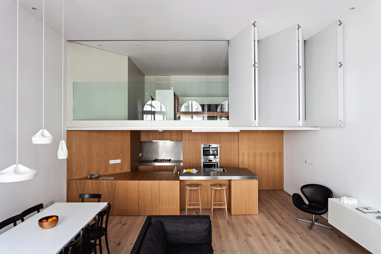
Then we wanted to make use of the height of the space (4.2 metres) so we included an additional mezzanine bedroom/study over the open plan kitchen, which could be closed off with a translucent polycarbonate folding screen - a large one opening on to the main living space, and a much smaller screen looking over the staircases at the back. When open, there are views from the front right through to the back bedrooms. At the same time, the spaces can be closed off with a large floor to ceiling pivoting door so that people can come and go with a level of privacy.

The finishes are simple – oak floors and joinery, and white painted plaster walls – so that it can suit the tastes of all the visitors. Although the feel of the flat is now very contemporary, (there were no original Victorian features left in the flat when we started work) the sense of an elegant Victorian drawing room has been partly restored by the careful refurbishment of the windows and shutters along the full width of the front.


.jpg?1378350056)

.jpg?1378350084)
.jpg?1378350119)
.jpg?1378350120)
